The Harvard Family Research Project separated from the Harvard Graduate School of Education to become the Global Family Research Project as of January 1, 2017. It is no longer affiliated with Harvard University.

Volume IX, Number 2, Summer 2003
Issue Topic: Evaluating Education Reform
Beyond Basic Training
“Cooking With Data” to Target Education Gaps
Craig Jerald of the Education Trust describes several basic ways of analyzing data to reveal a more complete picture of what education offers different groups of students.
The debate about who is to blame for large gaps in reading and math scores between minority and nonminority students has been playing out for decades in national education policy circles. However, only recently has this debate erupted with specificity in local communities, such as those in New York State last year.¹ It’s not hard to understand why. So far, fewer than half the states have published school- and district-level test scores broken out by race and poverty.
That soon will change. The federal No Child Left Behind Act requires that all states publish test scores by race and poverty over the next year. It also requires them to institute accountability systems that hold schools and districts responsible for sufficient levels of achievement by each student group, including poor, African-American, and Latino students.
While some educators already have begun consciously working to close achievement gaps, many think of them as a normal and largely unavoidable consequence of differences in family background, a kind of natural phenomenon well outside of their control. Educational leaders and practitioners will have to seriously reexamine such beliefs if they hope to begin making a dent in local achievement gaps.
Robust data analysis can help get the ball rolling. To start, practitioners must begin to more aggressively investigate whether the things that matter most for student learning—qualified teachers, a rigorous curriculum, challenging courses, effective instruction, adequate time, and sufficient resources—are just as available to youngsters on the bottom of the achievement gap as they are to those on the top.
That’s no small order. The vast majority of American educators—classroom teachers and administrators alike—have never been trained to deal with quantitative information. Here’s where evaluators can help practitioners understand and use basic data tools.
One obstacle has to do with technical terminology. Statisticians have developed a technical language to describe what they do, but for people with no formal training in statistics, words like disaggregated, longitudinal, and cross-tabulated can seem incomprehensible. An overreliance on technical terminology also makes education data much harder to communicate to essential partners like families and community groups.
Let me offer my favorite example. Last year I decided to learn how to cook. I started with nearly no knowledge about cooking. My idea of a personal culinary achievement involved Cocoa Puffs and cold milk.
I purchased a couple of thick cookbooks and set out to learn my way around the kitchen. But I soon ran into a frustrating obstacle—the cookbooks used words I didn’t know: glaze, reduce, puree, brown, braise .... The list went on and on!
Sometimes I’d try to figure out from context what the terms meant. But words like reduce flummoxed me. Fresh ingredients were expensive; why would anyone want to “reduce” them? Should I “brown” the meat with a crayon or a magic marker? I very nearly gave up in frustration.
Over time, however, the words have become less mysterious to me, and I am beginning to realize that cooking isn’t as complicated as those technical words at first made it seem. I also have learned that I can accomplish most of what I need to do in the kitchen with just a handful of basic maneuvers. The same, I believe, is true of basic educational data tools.
Below I offer three basic ways to analyze data that go beyond the tried and true averages and basic percentages. While averages are useful for making generalizations about, say, a group of students, they often obscure just as much as they reveal. The key is to dig beneath the averages to reveal a more complete picture of what an education system offers different groups of students.
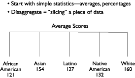
Technique One: Disaggregate
I like to think of this as slicing a piece of data to find out what the picture looks like for different subgroups hidden within an average or basic percentage. For example, the average score on the nation’s eighth-grade science test is 149, but that average is substantially different among different groups of eighth graders (see figure 1).
Figure 1: Disaggregate |
 |
| |
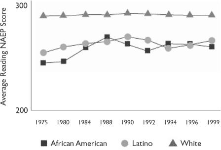
Technique Two: “Longitudinate”
I know that “longitudinate” isn’t exactly a real word, but it’s a chef’s privilege to coin words in his own kitchen! What I mean is looking at data over time with what are known as “longitudinal” statistics. I like to think of this as stretching a simple statistic out over a period of weeks, months, or years.
Obviously, such statistics are important for finding out whether something is getting better or worse. However, stretching a disaggregated statistic also can tell you whether things are getting more or less equal over time. For example, we know that during the 1970s and 1980s U.S. achievement gaps narrowed substantially, but during the 1990s they stayed the same or grew slightly wider (see figure 2).
Figure 2: “Longitudinate” |
| NAEP Reading Scores, 17 Year Olds |
 |
| |
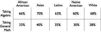
Technique Three: Cross-Tabulate
If disaggregating is like slicing, cross-tabulating is like dicing. Dicing data offers valuable glimpses into how an education system advantages or disadvantages different groups of students, and how the situation can be improved.
Here’s how it works. Begin by slicing a simple statistic by race, family income, or some other student characteristic. Then dice it by an important educational opportunity.
Say, for example, that you slice the 50 percent passing rate on your district’s eighth-grade math test and find large achievement gaps by race. Next dice those numbers by another set of student groups—those taking algebra and those taking only general math, for example, and another pattern will likely emerge, one that shows a gap not only by race, but also by course level and curriculum (see figure 3).
Figure 3: Cross-Tabulate |
| |
 |
| |
These basic ways of analyzing data depend on obtaining data for analysis. Because many state and local education officials are unused to providing data, obtaining data can be a time-consuming and difficult task. But there are tactics that make acquiring data easier too.
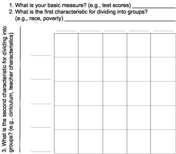
Data Matrices
I often resort to a simple template for planning and requesting cross-tabulations. The “matrix,” as I call it, is an easy way to describe to officials what cross-tabulated data you want by framing it as a fill-in-the-blanks request (see figure 4).
Figure 4: A Simple Template for Cross-Tabulations |
 |
Creative Data Linkages
I also have found that it helps to become informed about what information your local education organizations collect. If someone tells you that a question can’t be answered by the data files on hand, ask for a full list of all of the data elements in those files. By looking for connections across them, you can determine whether it would be possible to link them up to answer your questions.
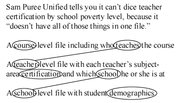
For example, if a district has a data file on secondary courses taught in the district, a file on teachers in the district, and a file on schools, it might be possible to combine them to answer the question, What percentage of high school courses are taught by uncertified teachers in the district’s high-poverty versus low-poverty schools? (see figure 5).
Figure 5: Push for Data Creativity |
 |
Now that federal law requires closing the achievement gaps that have plagued American society for decades, educators have a choice. They can commit to taking action by improving the distribution of educational opportunities and resources, or they can continue to believe that they are powerless because family circumstances ultimately determine learning.
Here’s my advice. Test your assumptions. Slice and dice the data. Dig beneath the averages. Make sure you know how your system works differently for different groups of students. You’ll be surprised at how much progress you can make by identifying and eliminating opportunity gaps in your own backyard.
¹ Hartocollis, A. (2002, March 28). Racial gap in test scores found across New York. New York Times, pp. A1.
Craig Jerald
Senior Policy Analyst
The Education Trust
1725 K St. NW, Ste. 200
Washington, DC 20006
Tel: 202-293-1217
Email: cjerald@edtrust.org
Website: www.edtrust.org
Excerpted from: Jerald, C. (2003). “Cooking with data” to reduce achievement gaps. ENC Focus, 10(1), 24–28. Available at: www.enc.org/features/focus/archive/data/document.shtm?input=FOC-003007-index. Reproduced with permission from Eisenhower National Clearinghouse (www.enc.org).